Friday, 27 February 2015

Sellotape and chemical transfers with backgrounds


This is a series of pages in my sketchbook contains my sellotape transfers and chemical prints on backgrounds I did. The fist one contains a chemical transfer of Ivor Abrahams' 1976 "The Sphinx". The background is some sketches which I painted over with white emulsion and continued with it onto the paper containing the print. I then added some vertical lines in pencil as it looked a bit bare and there was too much focus just at the top of the page. I feel the chemical print was successful as it captures the facial expression and a hint of the shape next to it. I found it really interesting how the chemicals completely changed the colours of the image from dark grey blues to a warmer range of bright reds and purples. I like the mottled effect it gives and think it would be really interesting on a large scale.


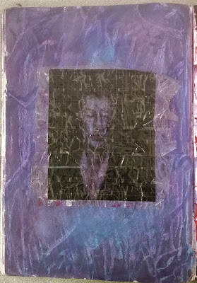
This page contains a sellotape transfer of Francis Bacon's "Sketch for a portrait of Lisa". I decided to create a background inspired by the colours in the face or the original image and enhance them so that they would come through in the face of my transfer. I used watercolours to paint the base of the background with a purple hue. I then added oil pastel and used a brush with turpentine to dissolve and blend the oil pastel like paint. I hadn't previously tried this technique and was surprised at how pigmented and blendable the oil pastel was when dissolved. I layered the oil pastel and chose to leave some of it as it was to create contrasting textural marks. I also learned about creating points of interest such as the blue area beneath the transfer. I really like this page as I feel the colours work well with the transfer and it has a strong impact upon seeing it first hand. I would like to continue using oil pastel and turpentine as it is much more versatile than simply drawing or using paint and the colours are rich and vibrant.


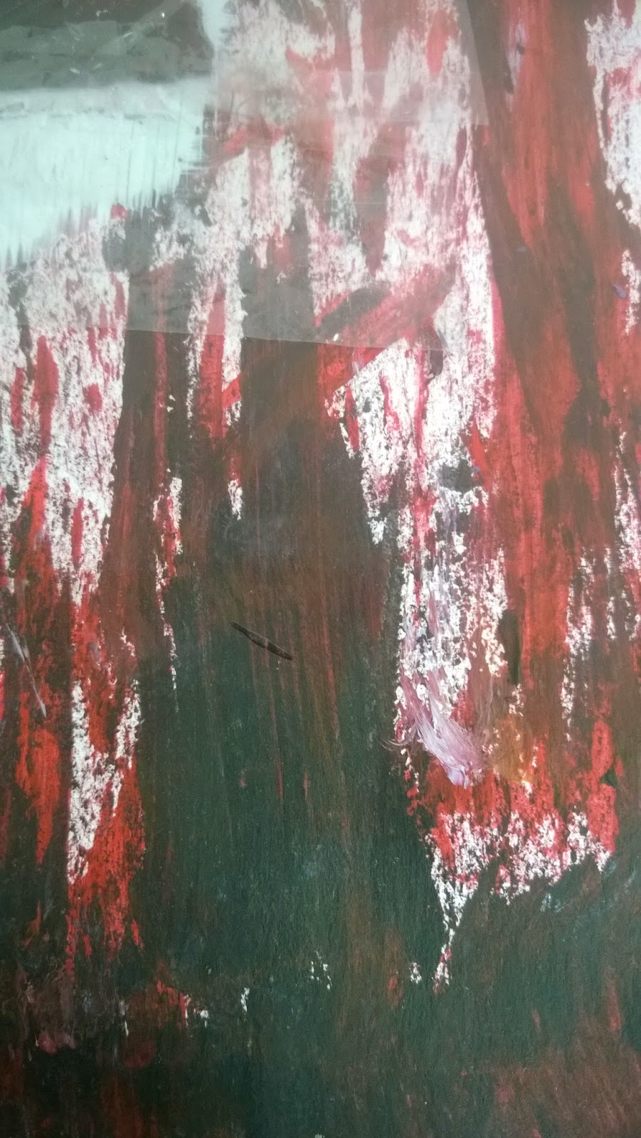
The following page contains my sellotape transfer of Ivor Abrahams' "A Predicament" with a painted background again influenced by the colours of the transfer.  I used the rough edge of pieces of cardboard to drag black, white, cadmium red and crimson paint across the page. I tried to achieve similar tones to that of the transfer and capture Abrahams' use of line and texture. I created a white base for the transfer so that it wouldn't get absorbed by the background and the details could show through. I had previously experimented with the cardboard painting method using black and white paint which prompted me to incorporate it into my work. I especially like the texture, colour variation and different lines that this technique achieved.



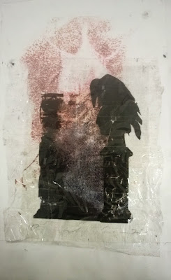
This page incorporates a chemical transfer of Francis Bacon's "Crucifixion" and a sellotape transfer of Ivor Abrahams' "The Raven". The chemical transfer brought through the shape of the image well and it fit with the raven as it blends into the translucent section in the middle. The mottled effect on this also matches the mottling on the chemical transfer. I felt these pieces went well together as both have quite an eerie feel about them and the original pieces are very dark, yet the transfer techniques have changed the colours providing contrast.


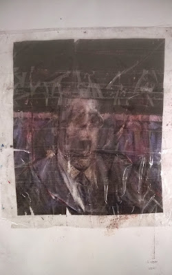
The final page contains my sellotape transfer of Francis Bacon's "Study for a Portrait". I chose to leave the background plain due to the first two backgrounds being very strong and vibrant as I didn't want to take away from their impact or make my sketchbook too over the top. Also the transfer isn't very translucent so a background wouldn't show through much and as the kept the strength of colour and shape of the original image well a background might over power it.


Friday, 20 February 2015

Printing

I did a printing workshop which involves rolling ink onto a plastic sheet then removing some of the ink to form a pattern before pressing the inked side of the sheet onto paper to create a print. I first practised with some simple patterns from the artist work I studied but these did not turn out clearly so I tried working from a Francis Bacon 1933 painting "Crucifixion" which had a more solid and distinct shape. I photographed the ink on the sheet because I liked the texture and varying tones where the ink had been wiped and sponged off. However the prints were unsuccessful and blurry, failing to show the delicacy of the variations in the ink. I feel this may be more successful if I tried it with various colours together as then the focus would be on the colour more than the detail which was lost in the prints. I also think it might have worked better if I had used more ink or pressed harder with the roller to allow the image to come through more.


Wednesday, 18 February 2015

Transfer techniques - experimenting with placement


These are transfers on cello tape of various images by Francis Bacon and Ivor Abrahams. I placed them in various places around college to experiment with changing the colour, composition and overall mood of the work. I feel some pieces were more successful than others as how see-through the transfer was and the shape and structure of the image in contrast to the background really altered the results of the experimentation.


At first I felt overall using this transfer of Francis Bacon's "Sketch for a Portrait of Lisa" was unsuccessful as due to the opaque colours the change in background didn't make much of a difference. However the close up gives a clearer view of the text behind the face which did produce an interesting result. Due to the size of the text it has been incorporated into the composition well as it fits with the size of the facial features. The white background also allows the purple hue of the skin to stand out which isn't so apparent on the original painting.


Of these transfer's of Ivor Abrahams' screen print "The Raven, I feel the one on the right with text was the least successful. The text didn't fit with the transfer and failed to really alter the composition or mood. However the transfer with paint running down the wall was successful as the contrast of vivd vertical lines running into the transfer gave it an entirely different feel and stripped some of its sombre gothic tones. It made it feel much less traditional and more modern. I feel this effect could have been exaggerated if the background of the transfer was slightly more transparent to allow the bright colours to really show through.


I really liked the outcome of using the college symbol on the door as a background for my transfers. I feel not only did it fit in terms of size but also in mood. The cross was the perfect compositional addition to really capture Abraham's morbid themes and influence from the poem "The Raven" by Edgar Allan Poe which was the basis for Abrahams' screen print. Also Abrahams frequently used red as the dominant colour in otherwise monochrome images in his series on Poe's work. The skull below the cross adds the the heavy presence of mortality, it looks as if the raven is watching over a grave. In the second picture the fact that this transfer is on a door opening to a bright area full of life and growth holds the possibility for many interpretations on this juxtaposition of life and death, religion and nature, mourning mortality and the continuation of growth and vitality.


I used this background again with Francis Bacon's "Study for a Portrait". The cross completely cancelled out the face until I took a close up due to the delicacy of the facial features on the transfer. I then tried taking a photograph with the flash on which resulted in the light being reflected off the shiny surface of the transfer and capturing the face but little of the cross in the background. The representation of religion is a key theme in many of Bacon's works and his most famous painting is that of a screaming pope. I find it very interesting how the man in this picture in also screaming but the cross blocks this out. It posses many similarities to the screaming pope and yet also prominent contrast. There could perhaps even be controversial religious undertones to this piece in comparison to Bacon's screaming pope. Overall I feel this composition was also very successful and I think adding the dross to my transfers has achieved a lot in the way of meaning and juxtaposition and really added to the overall image and structural balance.


Wednesday, 11 February 2015

Everyday items showing layers

These are a series of photographs I took around my house which I feel hold interesting layers, especially through texture and deterioration. I have done some observational drawing from various areas of these images.


Friday, 6 February 2015

Cy Twombly sketchbook studies

These studies are inspired by the work of Cy Twombly who I previously researched as well as analysing his work "Mars & The Artist" which was the main influence for the first two pages. For these studies I used biro, sharpie, pencil and oil pastel. On the first page I explored Twombly's technique and stylised handwriting as well as his expressive marks and symbolism. On the following page I explained my process of making studies of Twombly's work. On the final page I continued my studies of Twombly's work in different mediums. I feel these studies were successful as I really captured the textural element of Twombly's work through my layering of different mediums then scratching into the oil pastel. I would like to continue experimenting with oil pastel as I liked the effects it gave when blended and layered as well as the textural elements. I also like Twombly's use of red to contrast the muted pale colours he uses in the background and would like to incorporate this into my own work.


Wednesday, 4 February 2015

Oxford museums observational drawings

This page contains studies of items from the Oxford museums I visited. I chose them as I they had an interesting texture and captured the theme of layers well. I was especially interested in the skull which I took photographs of but as it was in a glass case the photographs were blurry so I drew it to capture some of the finer detail of the fractures and worn areas. The Sanskrit text relates to my previous studies exploring incorporating text into art.