Wednesday, 6 May 2015
Wednesday, 29 April 2015
Friday, 24 April 2015
Thursday, 23 April 2015
Photographs for my final piece
These are photographs I took of my friend as to work from for my final piece. I chose to use her as her hair is red and black which I wanted to incorporate as it relates to the colour palette of the artist Ivor Abrahams. I wanted to include Abrahams' dark gothic passion in my work and this colours evoke this. I asked my friend to pose with her hand visible in the picture as I wanted to draw from Egon Schiele's work in which he pays close attention to the details of the structure of hands. I hope to use his style throughout the whole picture but I am confident I can accomplish at least with the hands as I have practised his style of drawing hands several times in my sketchbook.
Labels:
My photographs
Wednesday, 22 April 2015
Friday, 17 April 2015
Wednesday, 1 April 2015
Biro and charcoal observational drawing
This is a quick biro observational drawing that I did and didn't like so I decided to add charcoal to improve the tone, add depth and even out the harsh lines. I think it really improved, especially the hair which before looked far too light and had no depth or texture. If I were to try to do an exclusively biro drawing in the future I would spend longer building the tone and not use such harsh lines. The main problem with it was that I used the biro as if I would a pencil when it does not have the same blending qualities and I cannot erase it.
This is a compilation of observational hand studies with the hand in different positions. Like the previous drawing I did it first in blue biro then went over it in charcoal to improve it. Before adding the charcoal it looked better than the biro face as I had spent more time on it and learnt from my mistake of using the biro too harshly. However the charcoal still really improved it and works well with the biro to create some contrast and colour variation. I tried to incorporate some of Egon Schiele's style by adding detail on the knuckles and making the finer and hand look more bony with a greater emphasis on the angles and shape of the hand.
This was an experimental piece using paint and biro. I made several handprints in white paint all over the page and a few light red handprints that I went over with the red to layer it and add texture. I then added two main red handprints which is one of my theme colours. I used blue biro to add the to hand over this with the outline and bony, emaciated Egon Schiele style fingers and some of the bone structure inside the hand. This relates to my theme by also showing the layers of the hand from the inside.
Labels:
My sketchbook work
Friday, 27 March 2015
Tuesday, 17 March 2015
Wednesday, 11 March 2015
Photographs of the hand in different positions for observational drawing


These are some photographs I took of my hand in different position to study for observational drawing and enhance my understanding of its structure and proportions which I had previously struggled with.
Labels:
My photographs
Wednesday, 4 March 2015
Francis Bacon colour study
I first stuck down an image of Francis Bacon's "Painting" I then used a palette of only primary colours to mix the various hues I found in the piece. I then layered sections of these clouds around the image in a collage-like style. It was interesting picking out the very many different variations in hue and tone throughout the painting and I was surprised by the vast variation. This exercise was very useful as I developed my skills in not only mixing colours but also understanding that a single painting holds an extensive variety of colour and it encouraged me to be more experimental with colour and not limit my palette so much.
Labels:
Artists,
My sketchbook work
Friday, 27 February 2015
Sellotape and chemical transfers with backgrounds
This is a series of pages in my sketchbook contains my sellotape transfers and chemical prints on backgrounds I did. The fist one contains a chemical transfer of Ivor Abrahams' 1976 "The Sphinx". The background is some sketches which I painted over with white emulsion and continued with it onto the paper containing the print. I then added some vertical lines in pencil as it looked a bit bare and there was too much focus just at the top of the page. I feel the chemical print was successful as it captures the facial expression and a hint of the shape next to it. I found it really interesting how the chemicals completely changed the colours of the image from dark grey blues to a warmer range of bright reds and purples. I like the mottled effect it gives and think it would be really interesting on a large scale.
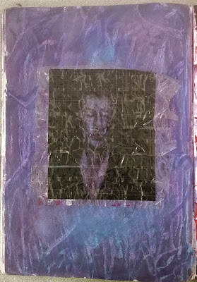
This page contains a sellotape transfer of Francis Bacon's "Sketch for a portrait of Lisa". I decided to create a background inspired by the colours in the face or the original image and enhance them so that they would come through in the face of my transfer. I used watercolours to paint the base of the background with a purple hue. I then added oil pastel and used a brush with turpentine to dissolve and blend the oil pastel like paint. I hadn't previously tried this technique and was surprised at how pigmented and blendable the oil pastel was when dissolved. I layered the oil pastel and chose to leave some of it as it was to create contrasting textural marks. I also learned about creating points of interest such as the blue area beneath the transfer. I really like this page as I feel the colours work well with the transfer and it has a strong impact upon seeing it first hand. I would like to continue using oil pastel and turpentine as it is much more versatile than simply drawing or using paint and the colours are rich and vibrant.
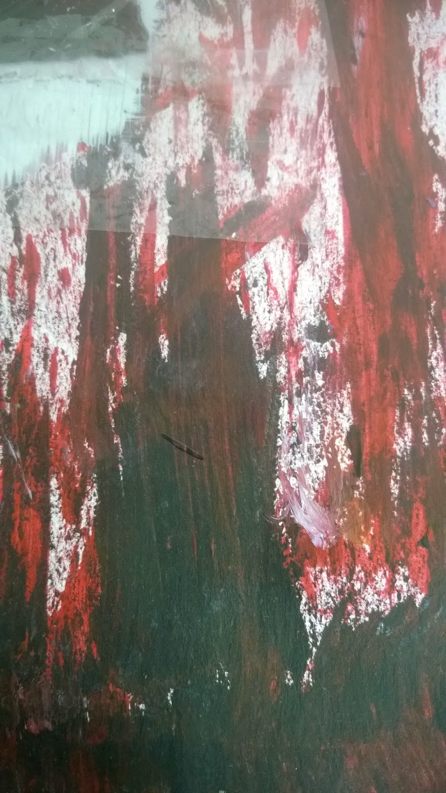
The following page contains my sellotape transfer of Ivor Abrahams' "A Predicament" with a painted background again influenced by the colours of the transfer. I used the rough edge of pieces of cardboard to drag black, white, cadmium red and crimson paint across the page. I tried to achieve similar tones to that of the transfer and capture Abrahams' use of line and texture. I created a white base for the transfer so that it wouldn't get absorbed by the background and the details could show through. I had previously experimented with the cardboard painting method using black and white paint which prompted me to incorporate it into my work. I especially like the texture, colour variation and different lines that this technique achieved.

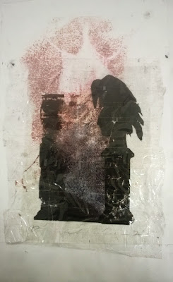
This page incorporates a chemical transfer of Francis Bacon's "Crucifixion" and a sellotape transfer of Ivor Abrahams' "The Raven". The chemical transfer brought through the shape of the image well and it fit with the raven as it blends into the translucent section in the middle. The mottled effect on this also matches the mottling on the chemical transfer. I felt these pieces went well together as both have quite an eerie feel about them and the original pieces are very dark, yet the transfer techniques have changed the colours providing contrast.
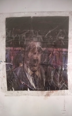
The final page contains my sellotape transfer of Francis Bacon's "Study for a Portrait". I chose to leave the background plain due to the first two backgrounds being very strong and vibrant as I didn't want to take away from their impact or make my sketchbook too over the top. Also the transfer isn't very translucent so a background wouldn't show through much and as the kept the strength of colour and shape of the original image well a background might over power it.
Labels:
My sketchbook work
Subscribe to:
Comments (Atom)


